Wavy
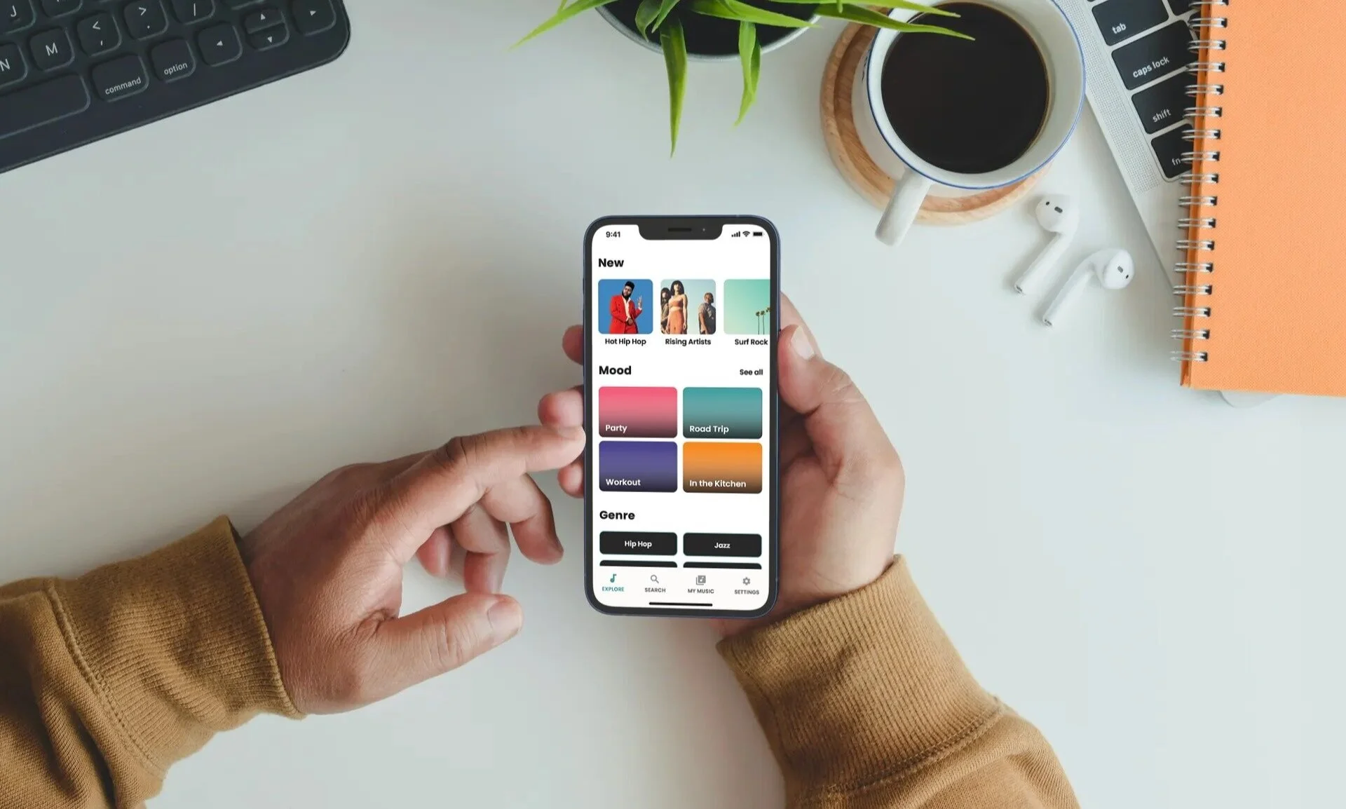
Wavy is a music streaming application. It was designed to be easy to use and visually appealing. Easily browse and discover new music, create playlists, download music and even look up and buy concert tickets all within the app.
My Role
UI Design
Visual Design
Timeline
March 2020
Tools Used
Sketch
Adobe XD
Lucidchart
Link to Prototype: Click here
Problem
I considered that people want control over their music. Whether they are creating playlists, downloading songs, listening to albums or artists, or being able to discover new music easily. The goal when creating Wavy was to do that in a visually appealing and easy-to-use interface.

Process
I used a Design Thinking process when designing for Wavy. I had to look at my target user base which is young to middle-aged adults that use their phones for listening to music. I conducted user interviews via phone and Zoom. I noticed some commonalities with my users.
They want control over their music (skip songs, add to playlists, like or dislike a song, download for offline listening, recommendations, and the ability to easily browse and discover new music).
They enjoy apps that are visually appealing and easy to use.
They depend on high-quality music streaming quality and music selection.
Challenge
To create an intuitive mobile user interface that pulls at a user’s emotions with minimal and engaging visual design. My main focus was delivering my Minimum Viable Product, by designing solutions for the problems at hand.
The MVP needed to have the following key features and functionalities:
Clear and easy way to search for music
Visually appealing and easy to use interface
Ability to see artist's in-depth profile, upcoming concerts/tour dates, and find and buy tickets.
Ability to discover new music
Ability to organize music
Ability to skip, like, dislike, download, add to playlist
Key User Flow & Wireframes
Visual Identity
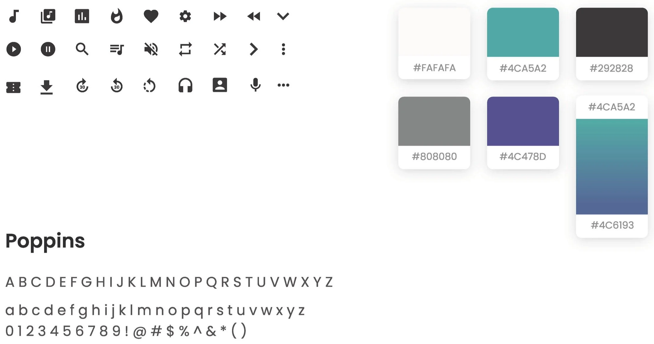
Simple and clean design. Black and white are the main colors with blue and purple for accents. I used a solid icon set for the app. I set out for a minimalist design with nice pops of color for the different genres and photography.

Less is More
Wavy delivers an experience that is based on the premise that less is more. The user interface is spacious and easy to navigate, the color palette is minimalistic and the information architecture is simple.
Final Thoughts
I learned quite a bit during this project. My main struggles were the time constraint, resources at hand, and staying within Apples Human Interface Guidelines. This project challenged me as a designer. I initially wanted to do something pretty different from whats currently out there as far as music apps go but I knew I had to follow the MAYA principle. In doing so I feel I designed an intuitive and beautiful user interface with all the necessary features and nothing more. Take a look at the full user testing and feedback here.


